Thrive 'n' Shine is a personal finance adventure game for web and mobile combined with an in-class curriculum for students.
Click the thumbnail above to check out the behind-the-scenes video on how the art was made for the game Thrive n' Shine.
My role as the Art Director included ownership of the art style and creation process as well as hiring artists to scale up the art content for the final game.
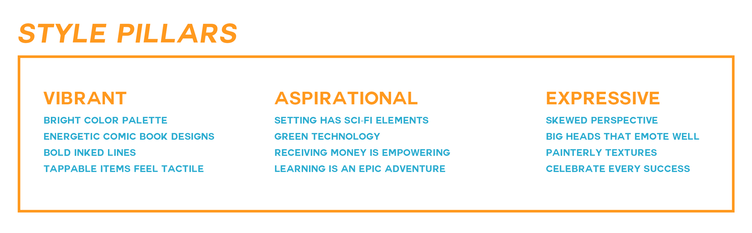
When I joined the team in March of 2013, the working prototype was functional but lacked a cohesive visual direction. My number one priority was to create an art style that would appeal to our target audience of middle schoolers and high schoolers. As someone who read comics and played games growing up, I explored vibrant styles that felt comic or cartoon-like and tested them with our potential players.
The next phase of development involved building a vertical slice of the game that we could release as a beta to receive a higher volume of feedback. During this time, we hired more artists that would help speed up production and elevate the overall quality of the art. Given the scope of the game and how fast we wanted to move, we were able to determine what roles we needed to fill.

Our beta release taught us a lot about what was working and what could be revised. The overall art style was getting there, though there were some issues with clarity at scale on mobile devices. Students loved the character creator and it really helped them to feel invested in doing well in the game.
The biggest piece of criticism we received from students who played the beta is that they didn’t understand what their goal was in the game and generally didn’t understand how the gameplay mechanics pieced together to form a cohesive loop. This feedback gave me an opportunity to refine our studio development to be more user-focused as a result of ux design mentorship at accelerator programs sponsored by Zynga and Idean.
UX+UI design was the missing piece to the puzzle that connected systems design and gameplay mechanics with the players experiencing our game. It was like a lightbulb went off when we shifted our development process to a user-centric approach.
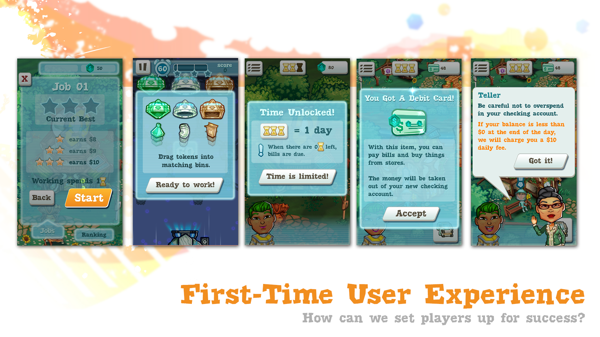
Click through the gallery below to see an overview of our studio’s UX+UI design process.


As we neared feature complete, the art team transitioned to more marketing, including the logo and trailer, as well as how to integrate in-game branding from sponsors like credit unions. I’m incredibly proud of this weird little indie game about personal finance and feel so blessed to have worked with the talented team to bring it to life!


